
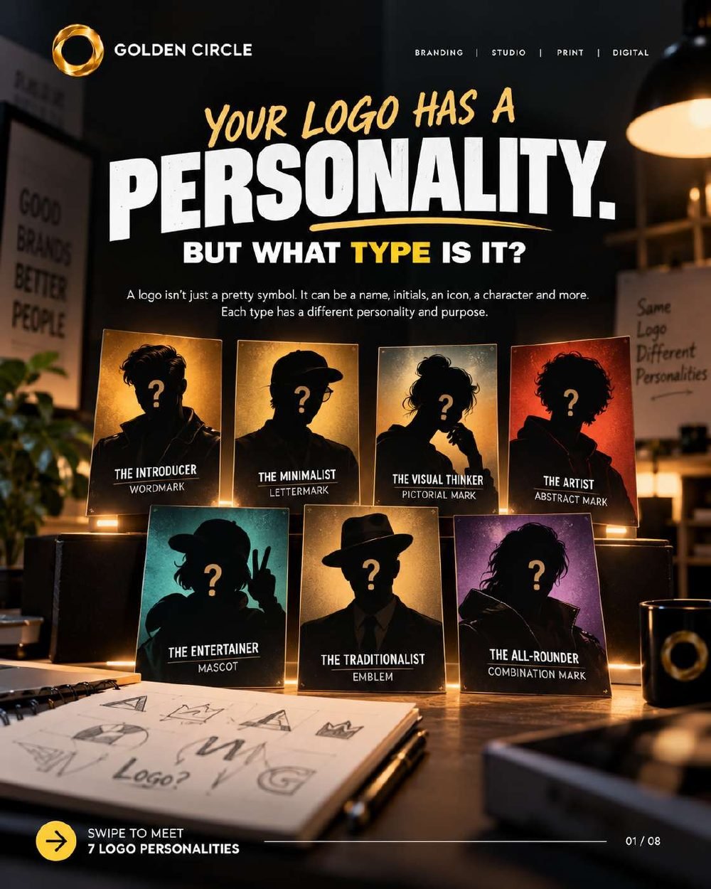
A logo isn't just a pretty symbol. It can be a name, a set of initials, an icon, a character or a mix of these, and each type has its own personality and purpose.
A logo gets you recognised. A brand gives people a reason to remember you. Because the logo is where that story starts, the type you choose shapes how your business shows up long before anyone reads a word about it.
Here are the seven types of logos, who they suit, and what to think about before you pick one.
Wordmark
The one who introduces themselves.
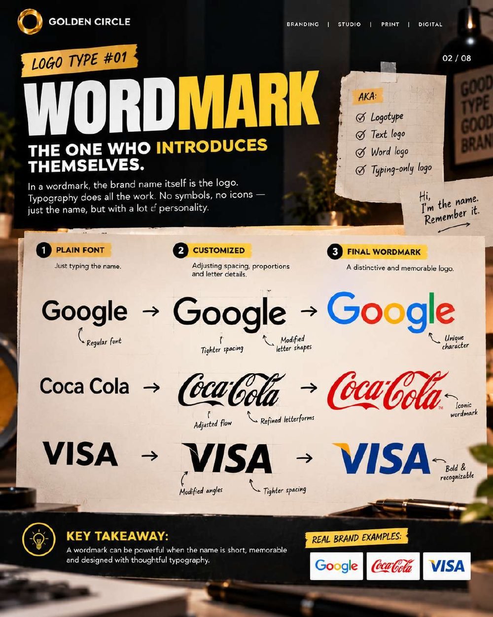
In a wordmark, the brand name itself is the logo. There is no symbol and no icon; typography does all the work. The route is usually the same: start with a plain font, adjust the spacing, proportions and letter details, then end up with something distinctive and memorable.
Seen inGoogle, Coca-Cola, Visa
Best forShort, memorable names
Takeaway. A wordmark is powerful when the name is short and memorable and the typography is designed with care.
Lettermark
The one who says it all in initials.
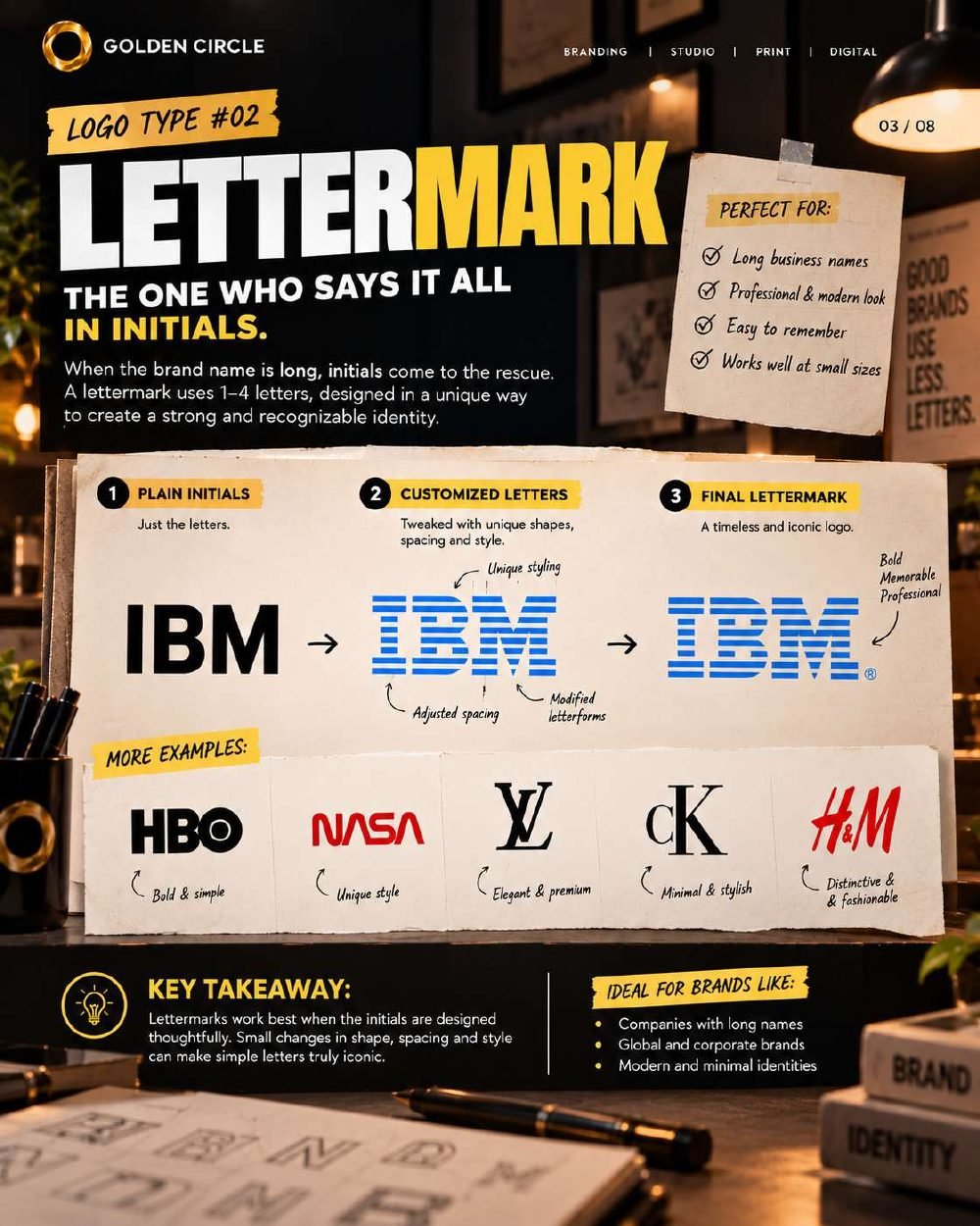
When a brand name is long, initials come to the rescue. A lettermark uses one to four letters, shaped in a unique way, to create an identity that is strong, professional and easy to recognise, even at small sizes.
Seen inIBM, HBO, NASA, Louis Vuitton, Calvin Klein, H&M
Best forLong business names, a modern and professional look, small-size use
Takeaway. Small changes in shape, spacing and style can turn plain letters into something iconic.
Pictorial mark
The one you recognise without reading.
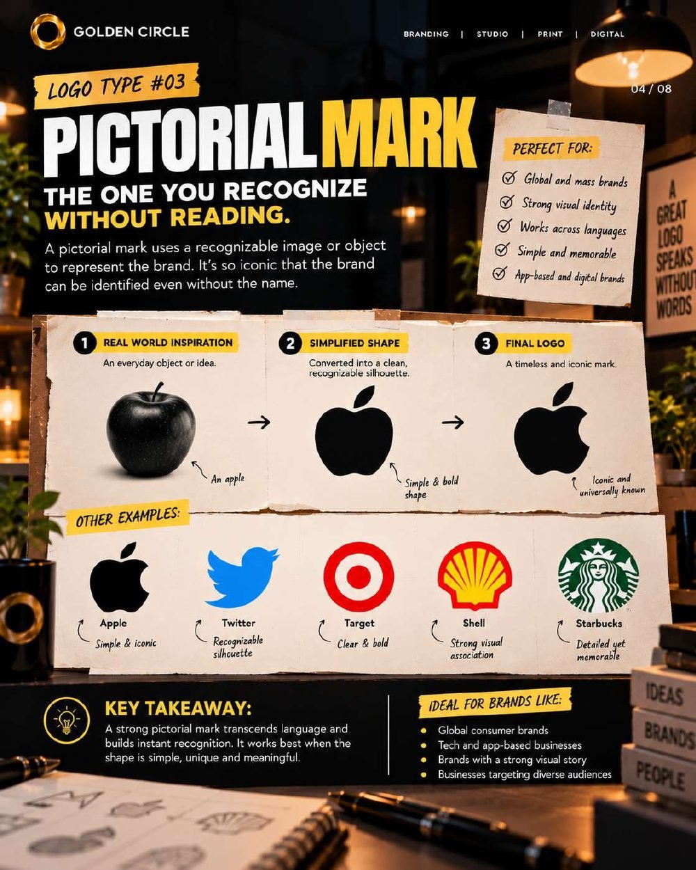
A pictorial mark uses a recognisable image or object to represent the brand. It starts from an everyday object, is simplified into a clean silhouette, and ends as a mark people can identify without the name. With no words involved, it travels easily across languages.
Seen inApple, Target, Shell, Starbucks
Best forGlobal and mass-market brands, app and digital brands, a strong visual identity
Takeaway. A pictorial mark works best when the shape is simple, unique and meaningful.
Abstract mark
The one who doesn't look like anything.
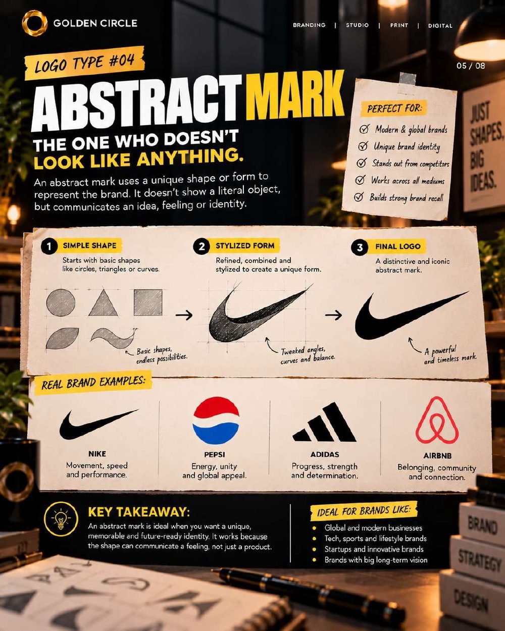
An abstract mark uses a unique shape that does not show a literal object. Instead it communicates an idea or a feeling, such as movement, energy, progress or belonging. It starts with basic shapes like circles, triangles and curves, refined into a form only your brand owns.
Seen inNike, Pepsi, Adidas, Airbnb
Best forModern and global brands, tech, sports and lifestyle, standing out from competitors
Takeaway. It is ideal when you want a memorable, future-ready identity, because the shape can carry a feeling rather than describe a product.
Mascot mark
The one you'd know at a party.
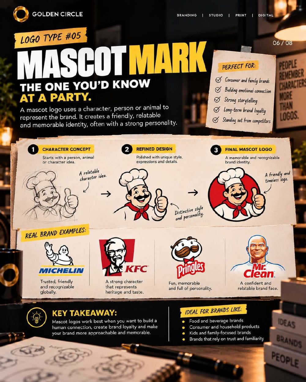
A mascot logo uses a character, person or animal to represent the brand. It creates a friendly, relatable identity with plenty of personality. It begins as a character concept and is refined into a polished, distinctive figure.
Seen inMichelin, KFC, Pringles, Mr. Clean
Best forFood and beverage, consumer and household products, kids and family brands
Takeaway. Mascots work when you want a human connection, long-term loyalty and a brand that feels approachable.
Emblem mark
The one with a story in a badge.
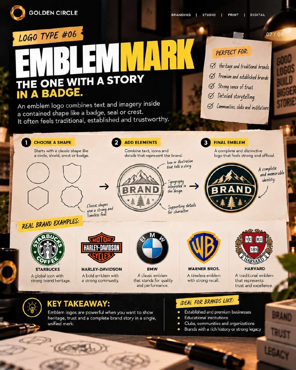
An emblem combines text and imagery inside a contained shape such as a badge, seal or crest. It tends to feel traditional, established and trustworthy, with typography and illustration built into a single unified mark.
Seen inStarbucks, Harley-Davidson, BMW, Warner Bros., Harvard
Best forHeritage and premium brands, educational institutions, clubs and communities
Takeaway. Emblems are powerful when you want to show heritage, trust and a complete brand story in one mark.
Combination mark
The one who brings everyone together.
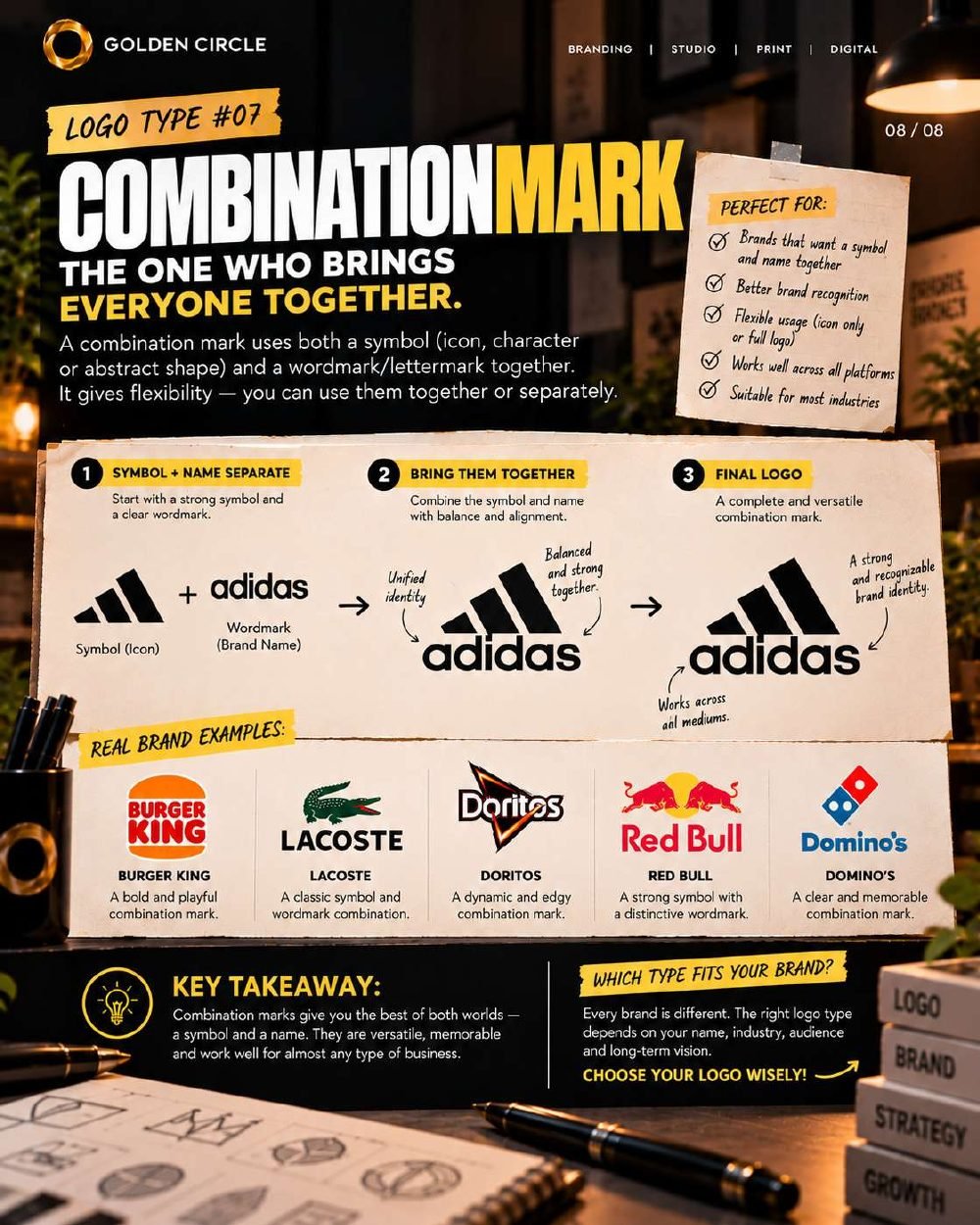
A combination mark pairs a symbol (an icon, character or abstract shape) with a wordmark or lettermark. Because the two can be used together or separately, it gives you flexibility across every platform.
Seen inAdidas, Burger King, Lacoste, Doritos, Red Bull, Domino's
Best forBrands that want symbol and name together, flexible use, better recognition across platforms
Takeaway. Combination marks give you the best of both worlds: a symbol and a name.
Which type fits your brand?
Every brand is different. The right type depends on your name, your industry, your audience and your long-term vision. As a starting point, look for the line that sounds most like you:
A logo is just the beginning.
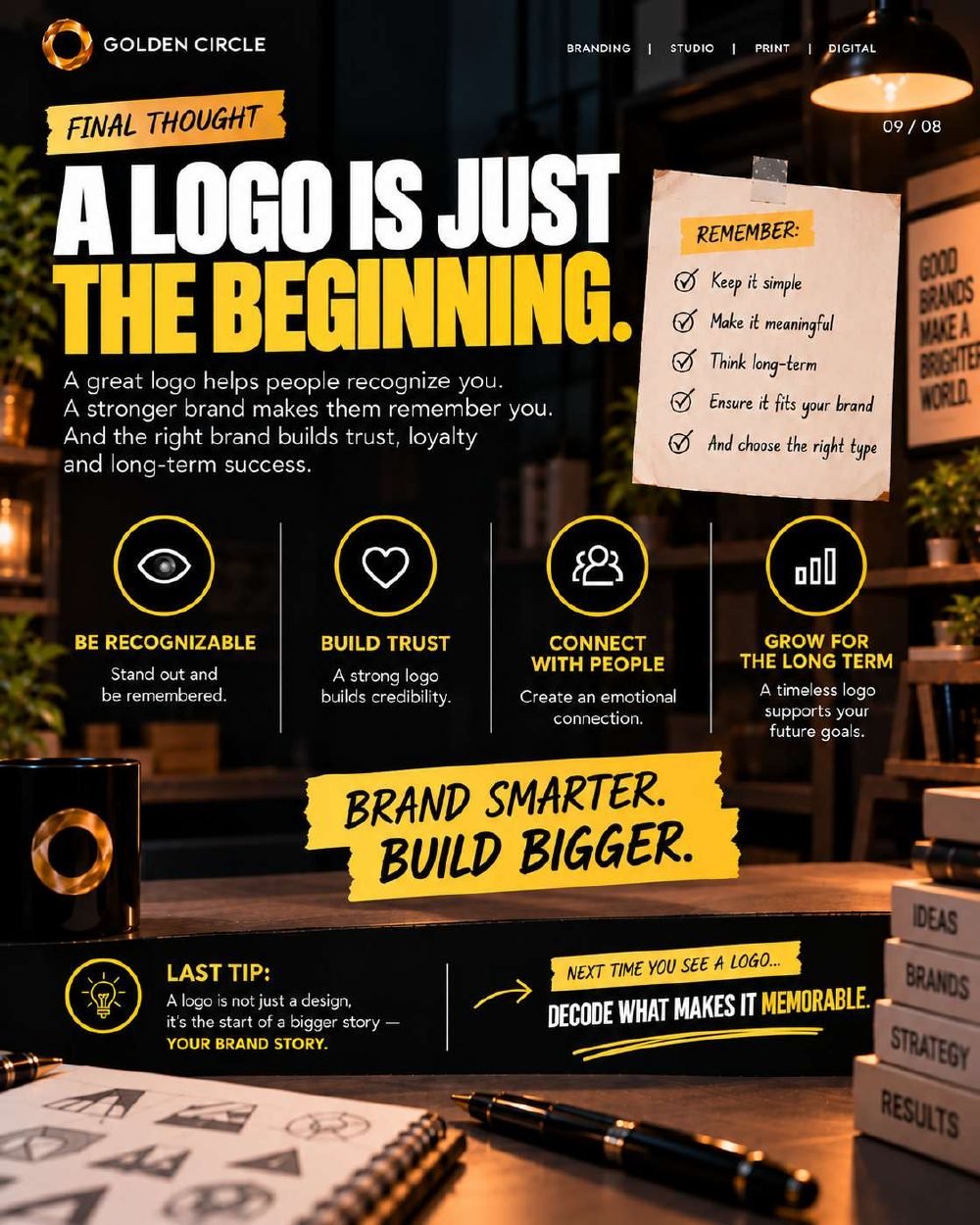
A great logo helps people recognise you. A stronger brand makes them remember you, and the right brand builds trust, loyalty and long-term success. Before you commit, remember five things:
- Keep it simple.
- Make it meaningful.
- Think long term.
- Make sure it fits your brand.
- Choose the right type.
Next time you see a logo, try to decode what makes it memorable.
Need help choosing the right logo?
Our branding team builds the whole identity, not just the mark: strategy, visual identity, collateral and guidelines.